Need some opinions about the Gmoccapy GUI
- HansU
-
 Topic Author
- Offline
- Moderator
-

Less
More
- Posts: 723
- Thank you received: 217
27 Apr 2023 16:39 - 27 Apr 2023 16:41 #270069
by HansU
Need some opinions about the Gmoccapy GUI was created by HansU
Two points I would like to hear your opinion about.
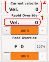
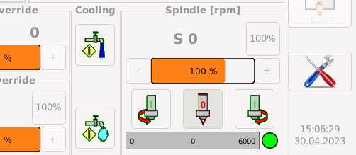
1. Currently gmoccapy shows the current velocity in the Rapid Override frame (1). I think the velocity does not really fit there. In earlier gmoccapy versions there was an override for maximum velocity, so that was correct.It is not really consistent with the other displays and a user could expect kind of a more static value like maximum_machine_velocity * override_factor.
I think we have three options here:
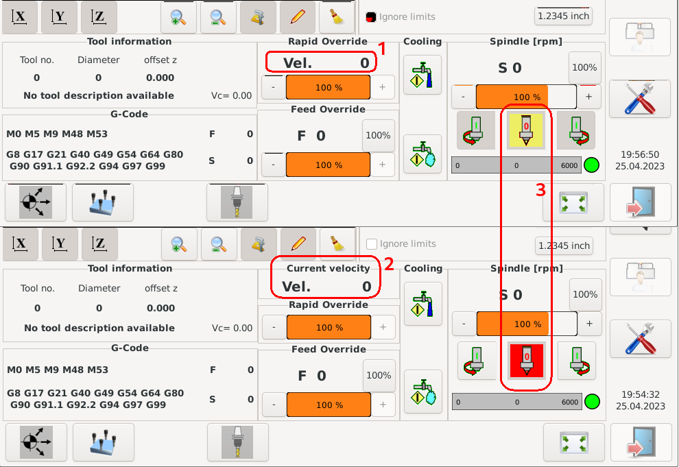
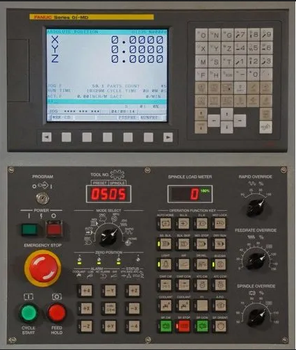
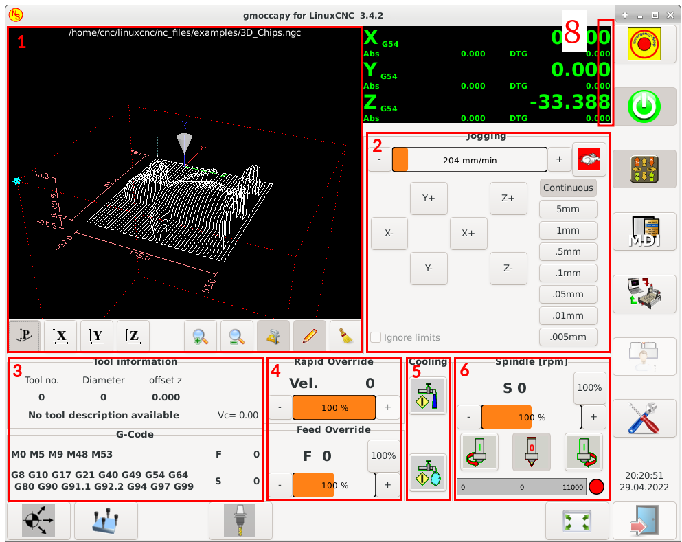
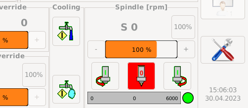
2. The spindle off button in spindle-off-state is currently yellow. Could be changed to red to be more consistent with usual operator panels like that e.g.:
1. Currently gmoccapy shows the current velocity in the Rapid Override frame (1). I think the velocity does not really fit there. In earlier gmoccapy versions there was an override for maximum velocity, so that was correct.It is not really consistent with the other displays and a user could expect kind of a more static value like maximum_machine_velocity * override_factor.
I think we have three options here:
- 1.1 Re-arrange the GUI that the current velocity gets its own frame (2). Disadvantage: looks a bit ugly and inconsistent.
- 1.2 Change the value of (1) to maximum_machine_velocity * override_factor. But I think the current velocity is more useful that this value)
- 1.3 Leave it as it is because it looks good this way and is clear enough
2. The spindle off button in spindle-off-state is currently yellow. Could be changed to red to be more consistent with usual operator panels like that e.g.:
Attachments:
Last edit: 27 Apr 2023 16:41 by HansU.
Please Log in or Create an account to join the conversation.
- 0x2102
-

- Offline
- Elite Member
-

Less
More
- Posts: 222
- Thank you received: 86
27 Apr 2023 18:41 - 27 Apr 2023 19:05 #270074
by 0x2102
Replied by 0x2102 on topic Need some opinions about the Gmoccapy GUI
Hello Hans,
1.) I personally would say "leave as is". Never really bothered me, but would be fine either way.
2.) I would agree "red" is better but yellow works for me here as well.
Since we are talking about "opinions", I thought I would ask about the +/- buttons and the jog and override sliders:
It would be great to make the sliders touchable (drag and move) to quickly adjust the settings. I hardly never use the +/- buttons, as they are too slow to adjust the setting.
I created a couple of custom buttons for jogging. Turtle might work here as well but it gives only 2 options.

Next to the override frames, I added custom buttons for rapid override / feed override. Again, same here: +/- is way to slow for making adjustment on the fly.
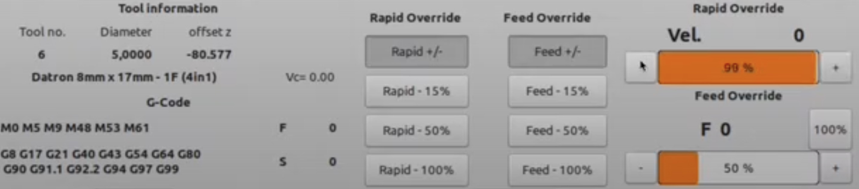
I understand that space might be limited on 15" screens, but on 17"+ touch I really like those buttons and use them frequently.
Maybe food for thought.
1.) I personally would say "leave as is". Never really bothered me, but would be fine either way.
2.) I would agree "red" is better but yellow works for me here as well.
Since we are talking about "opinions", I thought I would ask about the +/- buttons and the jog and override sliders:
It would be great to make the sliders touchable (drag and move) to quickly adjust the settings. I hardly never use the +/- buttons, as they are too slow to adjust the setting.
I created a couple of custom buttons for jogging. Turtle might work here as well but it gives only 2 options.
Next to the override frames, I added custom buttons for rapid override / feed override. Again, same here: +/- is way to slow for making adjustment on the fly.
I understand that space might be limited on 15" screens, but on 17"+ touch I really like those buttons and use them frequently.
Maybe food for thought.
Attachments:
Last edit: 27 Apr 2023 19:05 by 0x2102.
Please Log in or Create an account to join the conversation.
- newbynobi
-
- Offline
- Moderator
-
Less
More
- Posts: 1931
- Thank you received: 394
28 Apr 2023 05:14 #270096
by newbynobi
Replied by newbynobi on topic Need some opinions about the Gmoccapy GUI
Hallo Hans,
I would leave the speed indication as it is, I completely agree with you opinieon, that it is not placed perfect, but I do not like the "additional splitting" of the screen Design to get the vel in a separate frame.
According to the spindle button, I made it yellow in first step, as all active buttons has been yellow in the first decade of developing gmoccapy.
Now I agree, that red would be better.
Norbert
Please Log in or Create an account to join the conversation.
- zz912
-

- Offline
- Platinum Member
-

Less
More
- Posts: 592
- Thank you received: 96
29 Apr 2023 20:13 #270233
by zz912
Replied by zz912 on topic Need some opinions about the Gmoccapy GUI
Hello Hans,
I wish this:
1) Actual velocity
2) maximum_machine_velocity * override_factor
3) actual_feed_velocity * override_factor
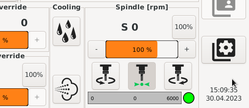
I don't like the red spindle button. To me, red means a mistake or danger. If you are going to use the color red for normal operation, you cannot escalate any warnings with the color red.
I wish another EMBED_TAB_LOCATION 8:
Sometime in the future, I would like to build a machine where all drivers will be connected to Modbus and I will display the load of all axes, just like adult machines have.
I wish this:
1) Actual velocity
2) maximum_machine_velocity * override_factor
3) actual_feed_velocity * override_factor
I don't like the red spindle button. To me, red means a mistake or danger. If you are going to use the color red for normal operation, you cannot escalate any warnings with the color red.
I wish another EMBED_TAB_LOCATION 8:
Sometime in the future, I would like to build a machine where all drivers will be connected to Modbus and I will display the load of all axes, just like adult machines have.
Attachments:
Please Log in or Create an account to join the conversation.
- blazini36
- Offline
- Platinum Member
-
Less
More
- Posts: 972
- Thank you received: 167
30 Apr 2023 06:10 #270294
by blazini36
Replied by blazini36 on topic Need some opinions about the Gmoccapy GUI
I can't recall off the top of my head but there is something odd about the spindle button, maybe it's because my machine is on 2.8....
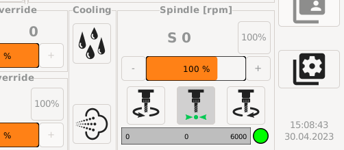
I think that when the spindle is on, the button goes grey. I always find that odd when I go to stop the spindle that the buttons are grey.
I think that when the spindle is on, the button goes grey. I always find that odd when I go to stop the spindle that the buttons are grey.
Please Log in or Create an account to join the conversation.
- HansU
-
Topic Author
- Offline
- Moderator
-
Less
More
- Posts: 723
- Thank you received: 217
30 Apr 2023 13:26 - 30 Apr 2023 13:28 #270306
by HansU
Replied by HansU on topic Need some opinions about the Gmoccapy GUI
Just talking about point 2 now.
I thought about having the icons without background and let CSS define the background. So everyone can use a custom css file. But that inferferes with the symbolic icons from other icon themes. So maybe it's not a good idea.
Without background
With background
Maybe something like this?
Do you have something like this in mind?
I still tend to
You always can use a custom theme with those buttons swapped or modified.
I thought about having the icons without background and let CSS define the background. So everyone can use a custom css file. But that inferferes with the symbolic icons from other icon themes. So maybe it's not a good idea.
Without background
With background
That was also my concern.I don't like the red spindle button. To me, red means a mistake or danger. If you are going to use the color red for normal operation, you cannot escalate any warnings with the color red.
Maybe something like this?
That's a good idea and easy to add.I wish another EMBED_TAB_LOCATION 8:
Sometime in the future, I would like to build a machine where all drivers will be connected to Modbus and I will display the load of all axes, just like adult machines have.
Yeah but it complies with the design that buttons with active states are highlighted.I can't recall off the top of my head but there is something odd about the spindle button, maybe it's because my machine is on 2.8....
I think that when the spindle is on, the button goes grey. I always find that odd when I go to stop the spindle that the buttons are grey.
Do you have something like this in mind?
I still tend to
You always can use a custom theme with those buttons swapped or modified.
Attachments:
Last edit: 30 Apr 2023 13:28 by HansU.
Please Log in or Create an account to join the conversation.
- newbynobi
-
- Offline
- Moderator
-
Less
More
- Posts: 1931
- Thank you received: 394
05 May 2023 05:10 #270696
by newbynobi
Replied by newbynobi on topic Need some opinions about the Gmoccapy GUI
First option is defenetely my favorite, Wow I like that one!
Modern and easy to interprate!
Norbert
Modern and easy to interprate!
Norbert
Please Log in or Create an account to join the conversation.
- HansU
-
Topic Author
- Offline
- Moderator
-
Less
More
- Posts: 723
- Thank you received: 217
05 May 2023 07:27 #270706
by HansU
Replied by HansU on topic Need some opinions about the Gmoccapy GUI
Which one? I posted 5 images... ")
Please Log in or Create an account to join the conversation.
- Aciera
-

- Offline
- Administrator
-

Less
More
- Posts: 4718
- Thank you received: 2114
05 May 2023 07:36 #270707
by Aciera
Replied by Aciera on topic Need some opinions about the Gmoccapy GUI
First one +1
Please Log in or Create an account to join the conversation.
- HansU
-
Topic Author
- Offline
- Moderator
-
Less
More
- Posts: 723
- Thank you received: 217
05 May 2023 08:33 #270712
by HansU
Replied by HansU on topic Need some opinions about the Gmoccapy GUI
Same here - which one?First one +1
Please Log in or Create an account to join the conversation.
Moderators: newbynobi, HansU
Time to create page: 0.750 seconds