
Re-designing the Gmoccapy DRO
- HansU
-
 Topic Author
- Offline
- Moderator
-

Less
More
- Posts: 730
- Thank you received: 217
02 Oct 2026 07:02 #350062
by HansU
Re-designing the Gmoccapy DRO was created by HansU
Currently there is much (unused) space between the axis letter and the value:

I thought the space could be used more effectively, so I moved one of the tiny sized values to the right and display the labels only at the top.
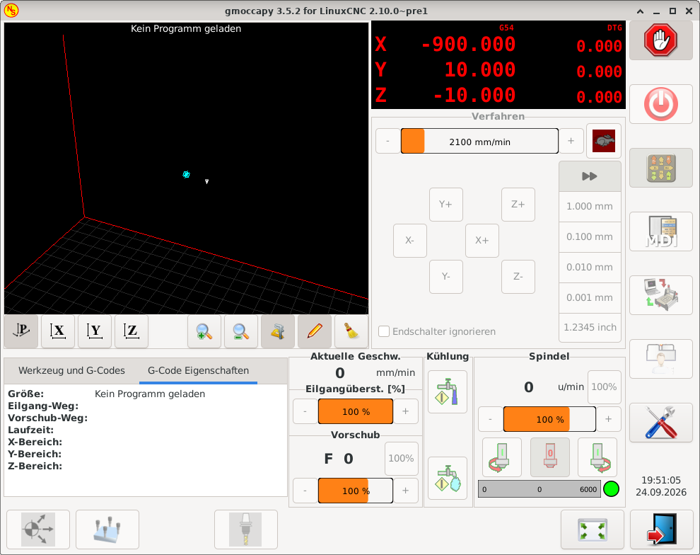
And I would display the current coordinate system (G5x) fixed at this position and only toggle the display of the right part.
For more than 4 axes I would only display the main value:
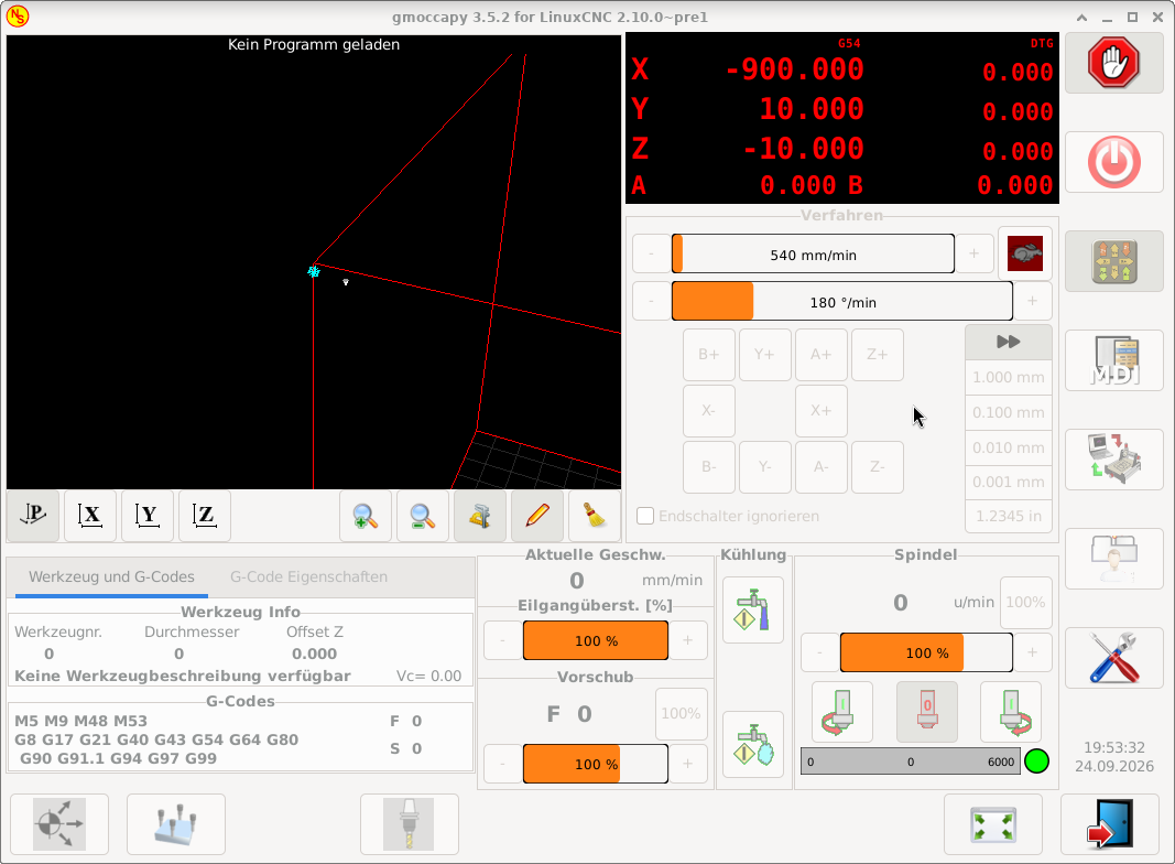
What do you think about that new design?
I thought the space could be used more effectively, so I moved one of the tiny sized values to the right and display the labels only at the top.
And I would display the current coordinate system (G5x) fixed at this position and only toggle the display of the right part.
For more than 4 axes I would only display the main value:
What do you think about that new design?
Attachments:
Please Log in or Create an account to join the conversation.
- grandixximo
-

- Offline
- Platinum Member
-

Less
More
- Posts: 339
- Thank you received: 406
02 Oct 2026 07:36 #350063
by grandixximo
Replied by grandixximo on topic Re-designing the Gmoccapy DRO
I think the A 0.000 should align right with the numbers above Z-10,000, where the last two zeros are on top of each other, maybe the dtgs could get a slightly less bright red to distinguish them more visibly.
Not sure why A and B needs the smaller text size, but looks ok.
You are removing information though, the Abs might deserve a switch, maybe on click/tap? maybe with some kind of hint, clicking on dtg changes it to abs?
Food for thoughts, not implementation requests
Not sure why A and B needs the smaller text size, but looks ok.
You are removing information though, the Abs might deserve a switch, maybe on click/tap? maybe with some kind of hint, clicking on dtg changes it to abs?
Food for thoughts, not implementation requests
Please Log in or Create an account to join the conversation.
- tuxcnc
- Offline
- Elite Member
-

Less
More
- Posts: 289
- Thank you received: 55
02 Oct 2026 08:49 #350065
by tuxcnc

Replied by tuxcnc on topic Re-designing the Gmoccapy DRO
Attachments:
Please Log in or Create an account to join the conversation.
- HansU
-
Topic Author
- Offline
- Moderator
-
Less
More
- Posts: 730
- Thank you received: 217
06 Oct 2026 19:36 #350154
by HansU
Just keeping the current arrangement:
linuxcnc.org/docs/devel/html/image/gui/i.../gmoccapy_5_axis.png
Yeah that's what I meant with "toggle the display of the right part." So don't rotate the displayed values, only switch between Abs and DTG in the right part.
Replied by HansU on topic Re-designing the Gmoccapy DRO
Not sure why A and B needs the smaller text size, but looks ok.
Just keeping the current arrangement:
linuxcnc.org/docs/devel/html/image/gui/i.../gmoccapy_5_axis.png
You are removing information though, the Abs might deserve a switch, maybe on click/tap? maybe with some kind of hint, clicking on dtg changes it to abs?
Yeah that's what I meant with "toggle the display of the right part." So don't rotate the displayed values, only switch between Abs and DTG in the right part.
Please Log in or Create an account to join the conversation.
- HansU
-
Topic Author
- Offline
- Moderator
-
Less
More
- Posts: 730
- Thank you received: 217
06 Oct 2026 19:37 #350155
by HansU
Yeah that's also a possibility, but the duplicated "G54" consumes too much space IMHO.
Replied by HansU on topic Re-designing the Gmoccapy DRO
Yeah that's also a possibility, but the duplicated "G54" consumes too much space IMHO.
Please Log in or Create an account to join the conversation.
- tuxcnc
- Offline
- Elite Member
-
Less
More
- Posts: 289
- Thank you received: 55
06 Oct 2026 21:43 #350157
by tuxcnc
If we assume that G54 needs to be displayed somewhere, then we might as well display it several times and we need to have room for G59.3 (two more characters).
What I pasted above was painted in Inkscape, in Gmoccapy there will be a different font, so it will look a little different.
I adopted the rule that everything that may be needed must be displayed, but the position in the current coordinate system should be displayed as large as possible and cannot be confused with anything else (hence the different colors).
Of course, someone may have a better idea, but this issue should not be considered in terms of what is beautiful and what is not for whom, it should only be useful and safe.
Replied by tuxcnc on topic Re-designing the Gmoccapy DRO
There is no way to avoid this.Yeah that's also a possibility, but the duplicated "G54" consumes too much space IMHO.
If we assume that G54 needs to be displayed somewhere, then we might as well display it several times and we need to have room for G59.3 (two more characters).
What I pasted above was painted in Inkscape, in Gmoccapy there will be a different font, so it will look a little different.
I adopted the rule that everything that may be needed must be displayed, but the position in the current coordinate system should be displayed as large as possible and cannot be confused with anything else (hence the different colors).
Of course, someone may have a better idea, but this issue should not be considered in terms of what is beautiful and what is not for whom, it should only be useful and safe.
Please Log in or Create an account to join the conversation.
- HansU
-
Topic Author
- Offline
- Moderator
-
Less
More
- Posts: 730
- Thank you received: 217
10 Oct 2026 13:27 #350186
by HansU
There cannot be different coordinate systems for different axes.
Replied by HansU on topic Re-designing the Gmoccapy DRO
Why do we need it several times?
Yeah that's also a possibility, but the duplicated "G54" consumes too much space IMHO.
There is no way to avoid this.
If we assume that G54 needs to be displayed somewhere, then we might as well display it several times and we need to have room for G59.3 (two more characters).
There cannot be different coordinate systems for different axes.
Please Log in or Create an account to join the conversation.
- tuxcnc
- Offline
- Elite Member
-
Less
More
- Posts: 289
- Thank you received: 55
10 Oct 2026 15:41 #350187
by tuxcnc
Removing G54 from all but one line will not give us any more space to display anything.
However, moving G54 to another line requires adding a new line, which means there will be less height for the position and more width, which we already have in excess of...
I'll say it again.
A CNC machine is not a toy, it may damage something or injure the operator, so the most important information and buttons must be large, legible and easy to find and use.
Whether it will be pretty or ugly is secondary.
I deleted all the G54s. Where will you put the G54 now (important information) and why will it be better?
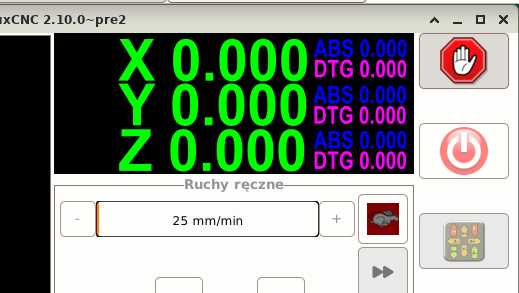
Replied by tuxcnc on topic Re-designing the Gmoccapy DRO
Because the window is wide and low.
Removing G54 from all but one line will not give us any more space to display anything.
However, moving G54 to another line requires adding a new line, which means there will be less height for the position and more width, which we already have in excess of...
I'll say it again.
A CNC machine is not a toy, it may damage something or injure the operator, so the most important information and buttons must be large, legible and easy to find and use.
Whether it will be pretty or ugly is secondary.
I deleted all the G54s. Where will you put the G54 now (important information) and why will it be better?
Attachments:
Please Log in or Create an account to join the conversation.
- HansU
-
Topic Author
- Offline
- Moderator
-
Less
More
- Posts: 730
- Thank you received: 217
10 Oct 2026 19:59 - 10 Oct 2026 20:05 #350189
by HansU
On top like in my example image.
This also has the advantage that on touch off the task bar doesn't hide the X value like it currently does (in fullscreen mode).
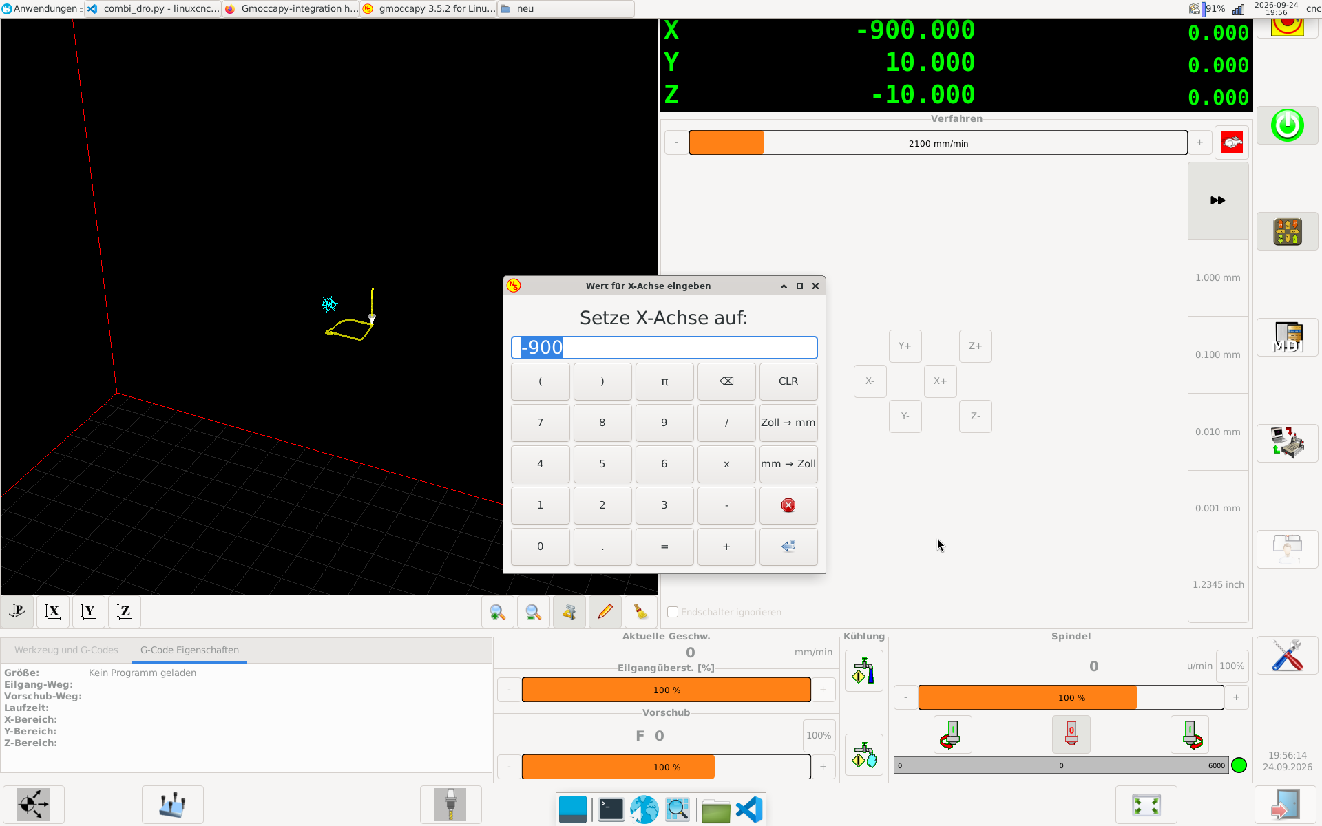
I also talked with Norbert that we might don't display the coordinate system at all in the DRO, because it is already displayed in the G-Codes section.
Replied by HansU on topic Re-designing the Gmoccapy DRO
I deleted all the G54s. Where will you put the G54 now (important information) and why will it be better?
On top like in my example image.
This also has the advantage that on touch off the task bar doesn't hide the X value like it currently does (in fullscreen mode).
I also talked with Norbert that we might don't display the coordinate system at all in the DRO, because it is already displayed in the G-Codes section.
Attachments:
Last edit: 10 Oct 2026 20:05 by HansU.
Please Log in or Create an account to join the conversation.
Moderators: newbynobi, HansU
Time to create page: 0.549 seconds