A Widescreen Blender-Style Interface
- BrendaEM
- Offline
- Elite Member
-

Less
More
- Posts: 266
- Thank you received: 120
29 May 2018 03:54 - 29 May 2018 04:07 #111242
by BrendaEM
Replied by BrendaEM on topic A Widescreen Blender-Style Interface
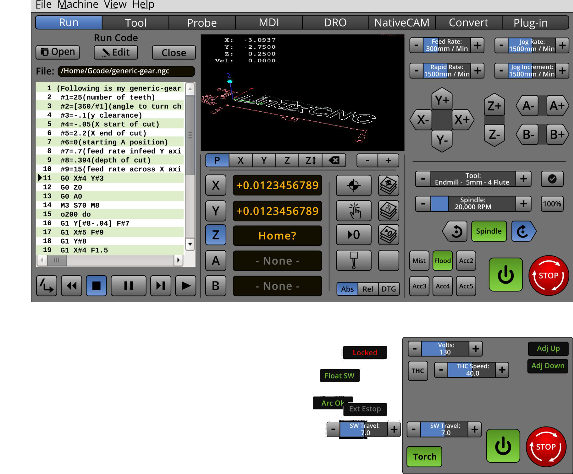
This is the Torch dilemma. Although I've thrown down some torch controls (which would replace the Milling controls) there are more of them. I because I don't have and use a torch, I don't know which ones are imperative to keep on hand, meaning that they get adjusted daily, and which ones might be moved to the "Tool" menu.
Could someone who has a torch give me a hint on which ones you use the most?
In the meantime, I want to rework (lower-center) location panel to once-again include coordinate systems.
Could someone who has a torch give me a hint on which ones you use the most?
In the meantime, I want to rework (lower-center) location panel to once-again include coordinate systems.
Last edit: 29 May 2018 04:07 by BrendaEM.
Please Log in or Create an account to join the conversation.
- BrendaEM
- Offline
- Elite Member
-
Less
More
- Posts: 266
- Thank you received: 120
29 May 2018 05:03 - 29 May 2018 05:04 #111243
by BrendaEM
Replied by BrendaEM on topic A Widescreen Blender-Style Interface
This is an experiment to include the user coordinate controls.
Some people may take issue with this but, I don't like seeing gcode on the user interface, unless they were a macro key for the user.
Also, I am not sure that shouldn't be a progressive chooser because it makes the panel look busy.
Speaking of busy, there should be a Fullscreen icon.
Some people may take issue with this but, I don't like seeing gcode on the user interface, unless they were a macro key for the user.
Also, I am not sure that shouldn't be a progressive chooser because it makes the panel look busy.
Speaking of busy, there should be a Fullscreen icon.
Last edit: 29 May 2018 05:04 by BrendaEM.
Please Log in or Create an account to join the conversation.
- KCJ
-

- Offline
- Platinum Member
-

Less
More
- Posts: 328
- Thank you received: 267
29 May 2018 05:18 #111244
by KCJ
Replied by KCJ on topic A Widescreen Blender-Style Interface
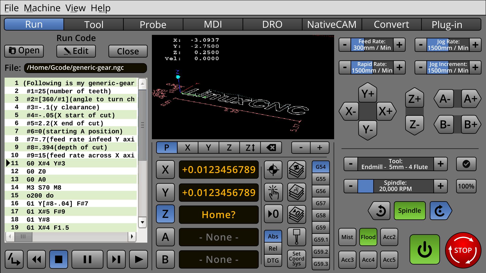
I'm not sure it is necessary to have the work cords on the Run screen. I think the only time I change it is when setting up a part or using MDI, so I guess it would make sense to have them on the on the probe screen. Don't really need it on the MDI tab as its easy to type in. Maybe the best thing would be a to a drop down menu on the Run tab to select/indicate the active work cords ...
Really looking good!
Cheers,
Kurt
Really looking good!
Cheers,
Kurt
The following user(s) said Thank You: BrendaEM
Please Log in or Create an account to join the conversation.
- BrendaEM
- Offline
- Elite Member
-
Less
More
- Posts: 266
- Thank you received: 120
29 May 2018 09:21 - 29 May 2018 09:23 #111247
by BrendaEM
Replied by BrendaEM on topic A Widescreen Blender-Style Interface
KCJ, I've seen people use the coords for multiple parts, and different fixturing.
What I was thinking is that the lefthand 1/3rd of the screen would be switched for different modes of operation, and then they could go fullscreen from there, if need be, So, the "Run" or "Run Code" is actually showing in the mockup.
So, if you want to use the MDI, to type something in, you click on the tab, and the "Code Runner" panel would be replaced with the MDI. This is why I wanted all of other positioning controls on center an right panels.
Last edit: 29 May 2018 09:23 by BrendaEM.
Please Log in or Create an account to join the conversation.
- KCJ
-
- Offline
- Platinum Member
-
Less
More
- Posts: 328
- Thank you received: 267
29 May 2018 14:00 #111261
by KCJ
Replied by KCJ on topic A Widescreen Blender-Style Interface
I did not realize only the left side of the screen was going to change based on the Mode, I like that very much! That means that 'muscle memory' will make it very easy to reach the more safety related controls on the right.
Please Log in or Create an account to join the conversation.
- BrendaEM
- Offline
- Elite Member
-
Less
More
- Posts: 266
- Thank you received: 120
31 May 2018 01:04 #111336
by BrendaEM
Replied by BrendaEM on topic A Widescreen Blender-Style Interface
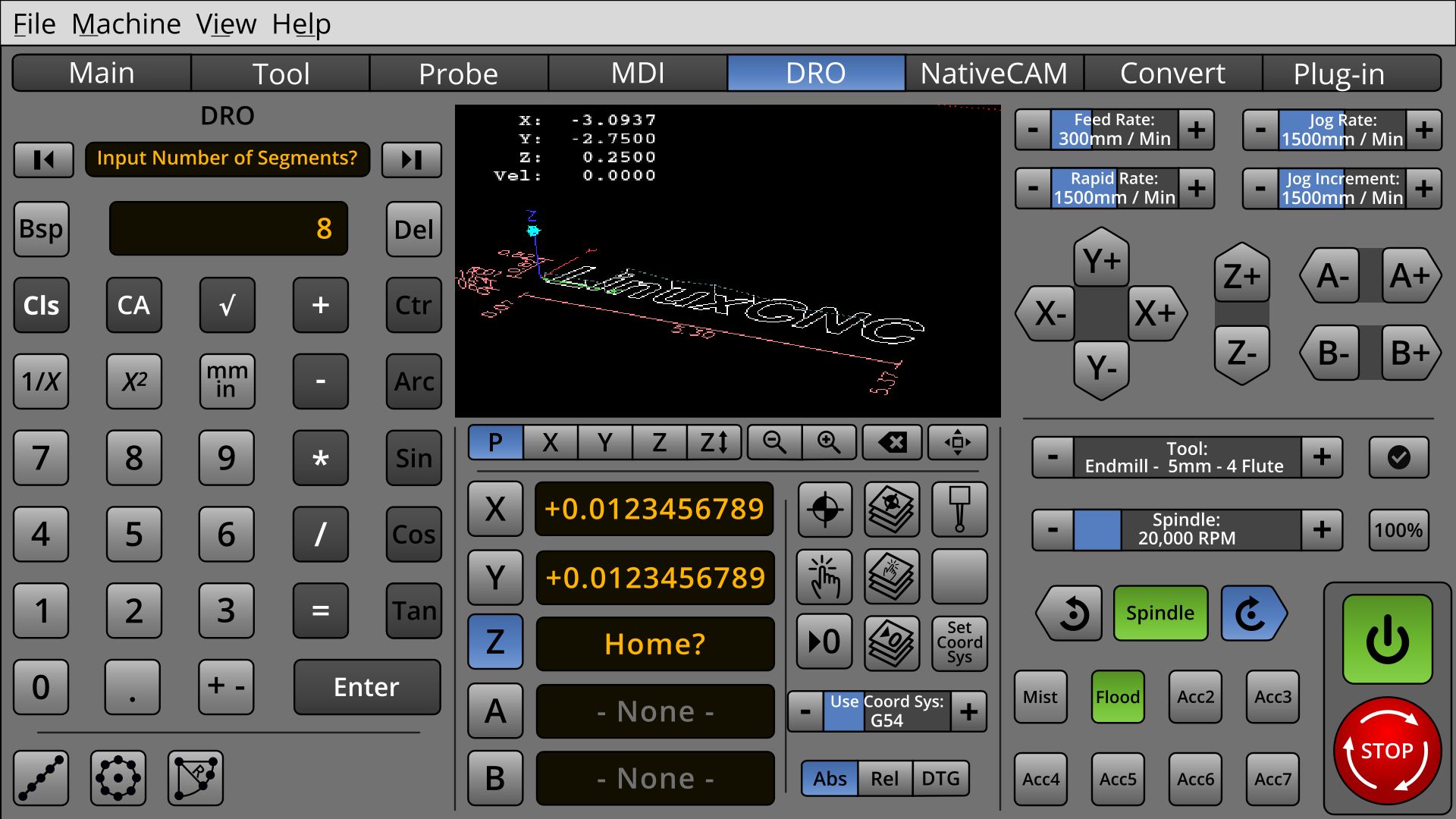
* Made still more room for the Mill / Torch / Laser specific controls.
* Changed User Coordinate Sets to Progressive Selector
* Reworked view controls for Clear/Sweep and Fullscreen, (For Touchscreen)
* Continued work on DRO.
* Cordoned off main power controls.
Note: DRO and Run-Code are toggled to display in the left-hand panel.
* Changed User Coordinate Sets to Progressive Selector
* Reworked view controls for Clear/Sweep and Fullscreen, (For Touchscreen)
* Continued work on DRO.
* Cordoned off main power controls.
Note: DRO and Run-Code are toggled to display in the left-hand panel.
The following user(s) said Thank You: tommylight, KCJ
Please Log in or Create an account to join the conversation.
- KCJ
-
- Offline
- Platinum Member
-
Less
More
- Posts: 328
- Thank you received: 267
31 May 2018 01:33 #111337
by KCJ
Replied by KCJ on topic A Widescreen Blender-Style Interface
That is looking really, really good!
I would defiantly be willing to help implement this screen in any way I can.
I am not any good at the graphics/human factors stuff, but I can help code.
Keep up the great work!
I would defiantly be willing to help implement this screen in any way I can.
I am not any good at the graphics/human factors stuff, but I can help code.
Keep up the great work!
Please Log in or Create an account to join the conversation.
- BrendaEM
- Offline
- Elite Member
-
Less
More
- Posts: 266
- Thank you received: 120
31 May 2018 01:41 - 31 May 2018 01:48 #111338
by BrendaEM
Replied by BrendaEM on topic A Widescreen Blender-Style Interface
Kcj, that sounds quite agreeable.
I am still moving around stuff, trying to get more room for the "Torch People" : )
I am trying to give this enough thought so it covers most needs. I wish I had my machine done, so I could get some better first-hand knowledge.
I want to try to lay rough out the other pages, just enough to make sure I haven't forgotten something on the main interface, which would be the tab-bar that runs across the top, and the center and right panels.
I am doing this in Inkscape, so the graphics can be output for either 1080 (or even 4k,) though I would like to keep a 16x9 aspect ratio, which may upset some people, but I want LinuxCNC to be forward-thinking and forward compatible.
Last edit: 31 May 2018 01:48 by BrendaEM.
Please Log in or Create an account to join the conversation.
- ozzyrob
-

- Visitor
-

31 May 2018 03:13 - 31 May 2018 03:19 #111342
by ozzyrob
Replied by ozzyrob on topic A Widescreen Blender-Style Interface
Just out of interest what size, in mm or inch would a "standard" button on the interface be in relation to a particular screen size?
Last edit: 31 May 2018 03:19 by ozzyrob.
Please Log in or Create an account to join the conversation.
- BrendaEM
- Offline
- Elite Member
-
Less
More
- Posts: 266
- Thank you received: 120
31 May 2018 04:03 #111344
by BrendaEM
Replied by BrendaEM on topic A Widescreen Blender-Style Interface
With a 14" monitor:
X,Y,Z controls are 10mm square.
With the upcoming changes, the Estop is 20mm square + whatever the gutter affords.
The power 20mm x 10mm.
The Increment adjuster ends are 7.5mm square.
The view controls are 10 x 7.5mm.
The Jog directional buttons are 10 x 15mm.
I've tried to keep a touch gutter around the perimeter of the screen,
The following user(s) said Thank You: ozzyrob
Please Log in or Create an account to join the conversation.
Time to create page: 0.264 seconds