A Widescreen Blender-Style Interface
- BrendaEM
- Offline
- Elite Member
-

Less
More
- Posts: 266
- Thank you received: 120
02 Jun 2018 05:23 - 02 Jun 2018 05:42 #111446
by BrendaEM
Replied by BrendaEM on topic A Widescreen Blender-Style Interface
Well, I had to upload something. : )
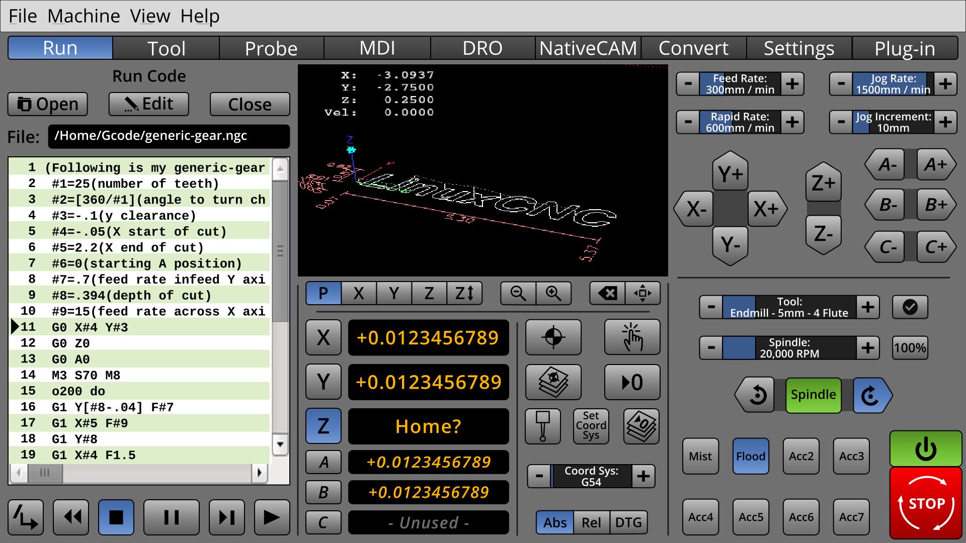
* Added C axis. That should be enough for most people. The A,B, and C axis are in italic which give an additional clue to help the eye sort them out, aside from size.
* The controls have standardized sizes. At 1920x1080 all the button controls size difference would be 4 pixels from the next size. (I still have to do the DRO.)
* MainEnterprise viewing screen is a bit larger.
* MIll: the Spindle controls use the shaded grouping.
I am sorry, I still have more work to do before I redo the torch controls.
("Flood" should have been lit green instead of blue.)
* Added C axis. That should be enough for most people. The A,B, and C axis are in italic which give an additional clue to help the eye sort them out, aside from size.
* The controls have standardized sizes. At 1920x1080 all the button controls size difference would be 4 pixels from the next size. (I still have to do the DRO.)
* Main
* MIll: the Spindle controls use the shaded grouping.
I am sorry, I still have more work to do before I redo the torch controls.
("Flood" should have been lit green instead of blue.)
Last edit: 02 Jun 2018 05:42 by BrendaEM.
Please Log in or Create an account to join the conversation.
- BrendaEM
- Offline
- Elite Member
-
Less
More
- Posts: 266
- Thank you received: 120
02 Jun 2018 23:53 - 02 Jun 2018 23:58 #111488
by BrendaEM
Replied by BrendaEM on topic A Widescreen Blender-Style Interface
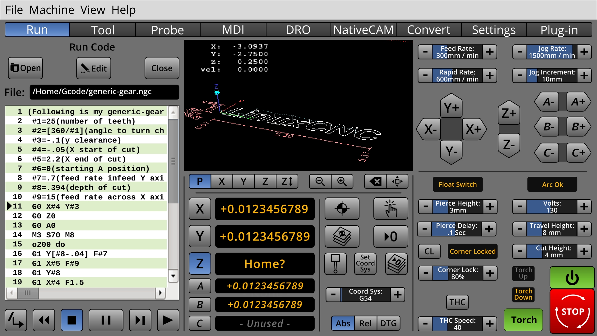
* Newer Torch Mini-Panel controls.
On this Torch mini panel attempt, I've tried to include everything on @Tommylight's list. There may not be enough here; there might be too much. I am sure that there are more settings which would need to go on the "Settings" page, but...
Which ones are used daily?
BTW, I find the LED's with legends space consuming, so I am still favoring good old-fashioned NASA control-room panel indicators, which go gray when not active.
When I look away from this for a while, I will know how to make it look better.
I want the only green things to be things which the user turns on.
I want red only to be things mean trouble.
Last edit: 02 Jun 2018 23:58 by BrendaEM.
Please Log in or Create an account to join the conversation.
- BrendaEM
- Offline
- Elite Member
-
Less
More
- Posts: 266
- Thank you received: 120
03 Jun 2018 00:45 - 03 Jun 2018 01:01 #111493
by BrendaEM
Replied by BrendaEM on topic A Widescreen Blender-Style Interface
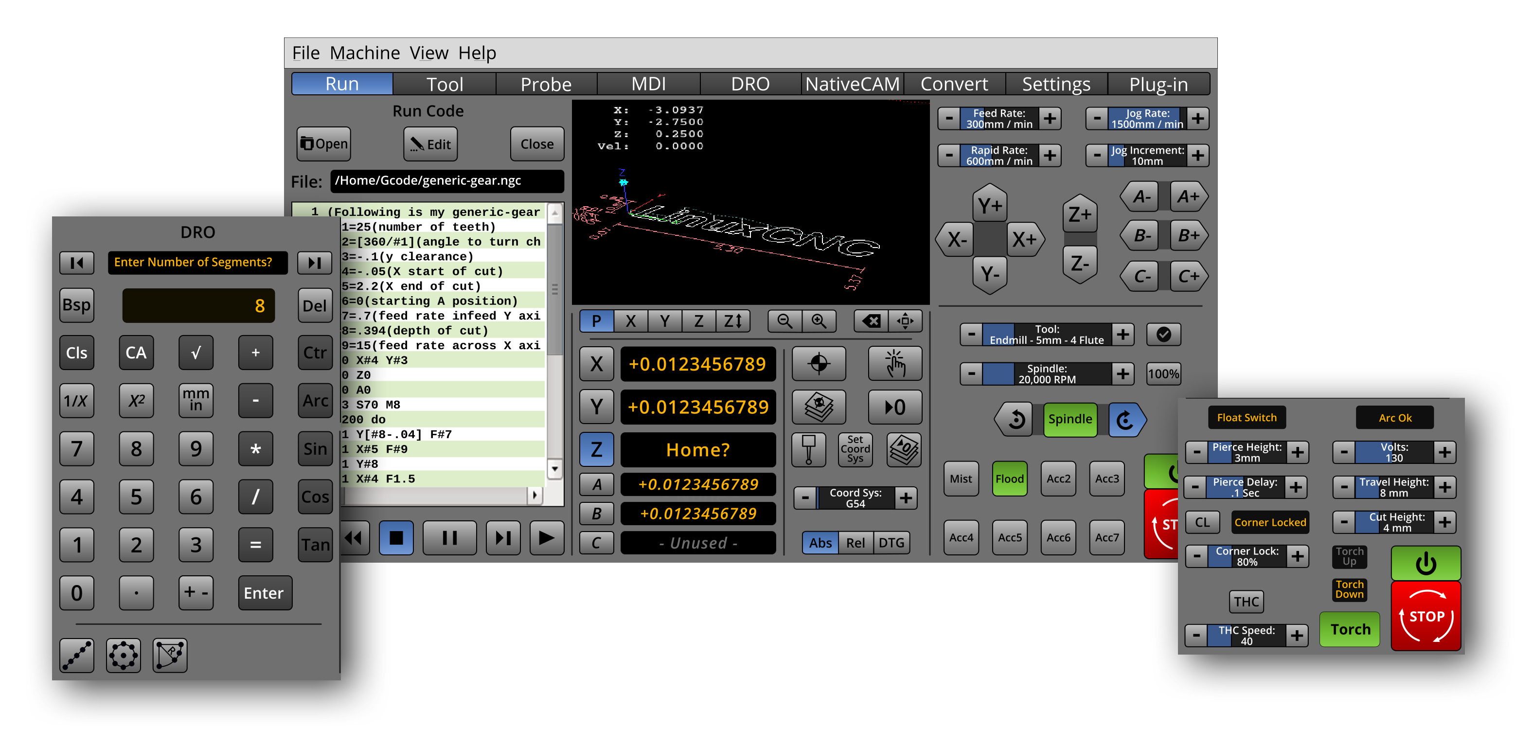
So, this is what there is so far.
I want to make an overlay for the lathe controls. I know it needs a diameter readout, and the A, B, C readouts would seem like the likely candidates. I think that X, Y, and Z, perhaps should stay the same for each. The italic font also seems to help for differentiating the axis groupings.
I want to make an overlay for the lathe controls. I know it needs a diameter readout, and the A, B, C readouts would seem like the likely candidates. I think that X, Y, and Z, perhaps should stay the same for each. The italic font also seems to help for differentiating the axis groupings.
Last edit: 03 Jun 2018 01:01 by BrendaEM.
Please Log in or Create an account to join the conversation.
- tommylight
-

- Away
- Moderator
-

Less
More
- Posts: 21734
- Thank you received: 7427
03 Jun 2018 16:25 #111518
by tommylight
When can i start using this?????? Now ? Now ? No yet...........
That looks really nice and usable, although i prefer having a big window with the parts to be cut ( gremlin ).
Thank you.
Replied by tommylight on topic A Widescreen Blender-Style Interface
* Newer Torch Mini-Panel controls.
On this Torch mini panel attempt, I've tried to include everything on @Tommylight's list. There may not be enough here; there might be too much. I am sure that there are more settings which would need to go on the "Settings" page, but...
Which ones are used daily?
BTW, I find the LED's with legends space consuming, so I am still favoring good old-fashioned NASA control-room panel indicators, which go gray when not active.
When I look away from this for a while, I will know how to make it look better.
I want the only green things to be things which the user turns on.
I want red only to be things mean trouble.
When can i start using this?????? Now ? Now ? No yet...........
That looks really nice and usable, although i prefer having a big window with the parts to be cut ( gremlin ).
Thank you.
The following user(s) said Thank You: rodw, BrendaEM
Please Log in or Create an account to join the conversation.
- andypugh
-

- Offline
- Moderator
-
Less
More
- Posts: 19876
- Thank you received: 4642
03 Jun 2018 18:24 #111535
by andypugh
Lathes almost never have a Y axis. (If there was a second toolpost it would probably be U)
Replied by andypugh on topic A Widescreen Blender-Style Interface
I want to make an overlay for the lathe controls. I know it needs a diameter readout, and the A, B, C readouts would seem like the likely candidates. I think that X, Y, and Z, perhaps should stay the same for each.
Lathes almost never have a Y axis. (If there was a second toolpost it would probably be U)
The following user(s) said Thank You: BrendaEM
Please Log in or Create an account to join the conversation.
- rodw
-

- Offline
- Platinum Member
-

Less
More
- Posts: 12027
- Thank you received: 4103
03 Jun 2018 20:45 #111552
by rodw
I'm with Tommy on this Looks awesome. For the first time opened it up full screen and touched a few buttons (couldn't help myself) The ease of use on a 16:9 monitor will be amazing!
Replied by rodw on topic A Widescreen Blender-Style Interface
When can i start using this?????? Now ? Now ? No yet...........
That looks really nice and usable, although i prefer having a big window with the parts to be cut ( gremlin ).
Thank you.
I'm with Tommy on this Looks awesome. For the first time opened it up full screen and touched a few buttons (couldn't help myself) The ease of use on a 16:9 monitor will be amazing!
The following user(s) said Thank You: tommylight, BrendaEM
Please Log in or Create an account to join the conversation.
- BrendaEM
- Offline
- Elite Member
-
Less
More
- Posts: 266
- Thank you received: 120
04 Jun 2018 17:41 - 04 Jun 2018 17:48 #111611
by BrendaEM
Replied by BrendaEM on topic A Widescreen Blender-Style Interface
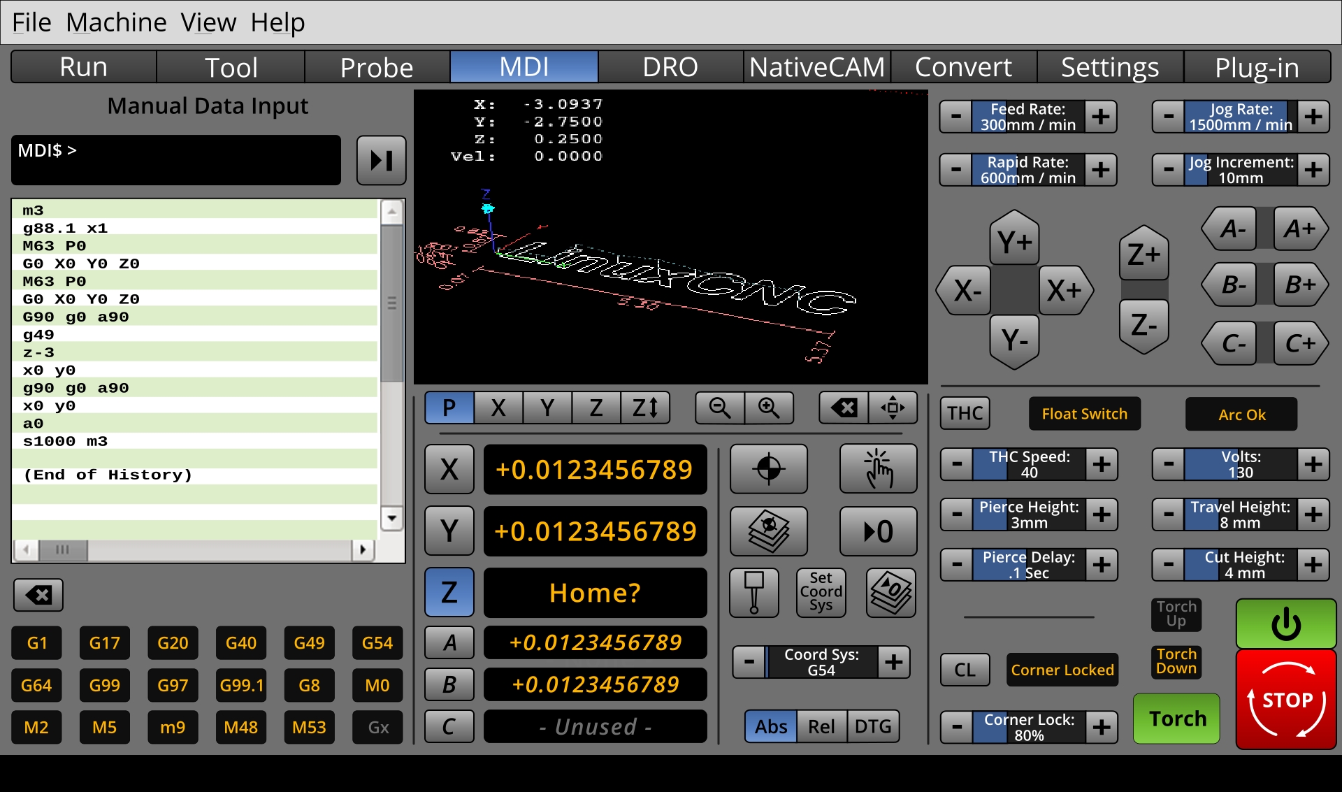
I was curious to see what the MDI would look like. Largely, it's just like Axis's one. I am not sure of the mode indicators would be appropriate. Personally, I would rather opt for something like NativeCAM, or manual milling on the DRO, but people seem to like this so....
Perhaps it would would be cool to have an on-screen keyboard, like Gmoccapy, that would occupy the right-hand 2/3rd areas of the screen, leaving room to run with the left panel open, or leave either the upper or lower right open.
Perhaps there should be load/save buttons on MDI?
Perhaps it would would be cool to have an on-screen keyboard, like Gmoccapy, that would occupy the right-hand 2/3rd areas of the screen, leaving room to run with the left panel open, or leave either the upper or lower right open.
Perhaps there should be load/save buttons on MDI?
Last edit: 04 Jun 2018 17:48 by BrendaEM.
The following user(s) said Thank You: chimeno, tommylight
Please Log in or Create an account to join the conversation.
- andypugh
-
- Offline
- Moderator
-
Less
More
- Posts: 19876
- Thank you received: 4642
04 Jun 2018 17:49 #111612
by andypugh
Replied by andypugh on topic A Widescreen Blender-Style Interface
One annoying thing missing from Touchy is any kind of MDI history.
But it does have an interesting context-aware way of working. You might like to have a play in the sim.
It works with just a numeric keypad, as it offers you the possible letter commands to match your G or M code.
But it does have an interesting context-aware way of working. You might like to have a play in the sim.
It works with just a numeric keypad, as it offers you the possible letter commands to match your G or M code.
Please Log in or Create an account to join the conversation.
- Sparky961
-

- Offline
- Elite Member
-
Less
More
- Posts: 210
- Thank you received: 15
06 Jun 2018 01:54 - 06 Jun 2018 01:57 #111712
by Sparky961
Replied by Sparky961 on topic A Widescreen Blender-Style Interface
I'll jump on the bandwagon too. This is very slick looking, and I'm happy to see that you're taking the time to think about layout and functionality.
My two cents, whatever that's worth these days:
- A touchscreen "e-stop" is not a safety device, so it's priority is actually lower than one would think. Any machine that has the ability to severely injure and maim needs to have a more sophisticated physical hardware-based e-stop circuit. When the poop starts flying, and you've just sprinted across the room/shop while hurdling various impeding objects, you need a BIG RED MUSHROOM that's easy to smack.
- One of my gripes about the current AXIS interface is with the sliders that control jog speed, feed override, etc. You just don't get the same fine-grained control that you do with a big chunky knob with detents on an industrial machine. If your wrist twitches a little you might even drive the feed WAY too fast and break a cutter or scrap a workpiece. I don't know the solution, but it seems like you might be the right person to figure out something that works better! Definitively selecting increments of 5% or 10% without trying too hard would make me very happy.
- I'm not a fan of "picture only" buttons. They are often illustrative enough to figure out, but very often NOT. Something that would help when learning the interface would be to have a small button that toggles an overlay with textual information - for when the user forgets (or can't figure out) what a certain button does.
Thanks for your efforts and enthusiasm with this. I hope it isn't becoming bigger than you imagined - unless that's what you want.")
My two cents, whatever that's worth these days:
- A touchscreen "e-stop" is not a safety device, so it's priority is actually lower than one would think. Any machine that has the ability to severely injure and maim needs to have a more sophisticated physical hardware-based e-stop circuit. When the poop starts flying, and you've just sprinted across the room/shop while hurdling various impeding objects, you need a BIG RED MUSHROOM that's easy to smack.
- One of my gripes about the current AXIS interface is with the sliders that control jog speed, feed override, etc. You just don't get the same fine-grained control that you do with a big chunky knob with detents on an industrial machine. If your wrist twitches a little you might even drive the feed WAY too fast and break a cutter or scrap a workpiece. I don't know the solution, but it seems like you might be the right person to figure out something that works better! Definitively selecting increments of 5% or 10% without trying too hard would make me very happy.
- I'm not a fan of "picture only" buttons. They are often illustrative enough to figure out, but very often NOT. Something that would help when learning the interface would be to have a small button that toggles an overlay with textual information - for when the user forgets (or can't figure out) what a certain button does.
Thanks for your efforts and enthusiasm with this. I hope it isn't becoming bigger than you imagined - unless that's what you want.
Last edit: 06 Jun 2018 01:57 by Sparky961.
The following user(s) said Thank You: BrendaEM
Please Log in or Create an account to join the conversation.
- BrendaEM
- Offline
- Elite Member
-
Less
More
- Posts: 266
- Thank you received: 120
06 Jun 2018 03:11 - 06 Jun 2018 03:14 #111716
by BrendaEM
Replied by BrendaEM on topic A Widescreen Blender-Style Interface
Hi Speakry691,
I agree that no screen E-stop is going to replace a hardware one. For the CNC i've been building, the Es-stop and the power button are the same, so I get used to knowing where it is. Yet, during a calamity, I want to want to offer the user a graceful shutdown up until that point. I've tried to make the screen E-stop, recognizable, but keep it different in the case by keeping it square so it is different than the hardware plunger.
I should think that when the interface is coded, the tap sliders would be incremental. These are largely copied from Gmoccapy's excellent controls, but with a 2nd line of text on them. The tap increment should be a .ini user setting.
One thing that's difficult about touch interfaces is that there is no mouse-over for help. There are a few new icons to a CNC, such as the Touch, and the Clear or Sweep function, but these are fairly standard, based on other Linux controls. The transport controls such as Stop, Next, and well, Play or Run, have been around since the invention of the tape recorder. I've tried not to "overload" controls, in that the Step-Forward control which looks like this [ >| ] will only do the same thing everywhere.
Well, I want to trying to give some little effort back to LinuxCNC, and I have an ulterior motive: to make it better for me, too.
BTW, the last image was a bad export. That's what the black bar is about.
Last edit: 06 Jun 2018 03:14 by BrendaEM.
Please Log in or Create an account to join the conversation.
Time to create page: 0.308 seconds